
Lyndon Hood - At-Homeboy, Lower Hutt
Thursday, January 26, 2006
New Hood: News We Missed Because of the Holidays
Whales May Be Developing Nuclear Weapons: Japan
National Party Press Secretaries Chained to Desks Over Holidays, Writing Press Releases for Food
No Unprecedented Natural Disasters in 2006 So Far
Wayne Mapp Accidentally Eradicates Self
Next Census to Allow Wholly Uninformative Ethnicity Response
Prison Construction Growth Industry of 2006
Lyndon Hood - Unscheduled Announcement, Lower Hutt
Monday, January 16, 2006
I did say I'd mention new WIT shows, so here, several days after it started, is:
It's still not too late to catch The All-New Old-Time Radio Show at Bats. What may be the very first on-stage comedy improvised radio show. If they get their podcast running, that will be quite the novelty too.
I endorse it heartily, even though I am not in it.
Finishes Saturday! Oh no! Hurry!
It's still not too late to catch The All-New Old-Time Radio Show at Bats. What may be the very first on-stage comedy improvised radio show. If they get their podcast running, that will be quite the novelty too.
I endorse it heartily, even though I am not in it.
Finishes Saturday! Oh no! Hurry!
Lyndon Hood - Pit of Depravity, Lower Hutt
Saturday, January 07, 2006
Street Art: Lower Hutt
Our local shopping centre - the Westfield Queensgate mall - has been expanding. I reckon it's alright, as far as big places where you can shop go. But probably not worth trekking out from Wellington for as a matter of habit.
Anyway, towards the end of last year - as I recall, around the end of the election campaign -
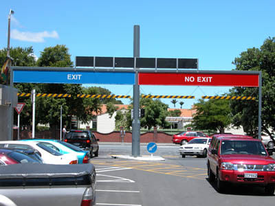
the attached Woolworth opened and we got to see the mall's new carpark signage. In the context of certain billboards, I found it kind of amusing:
I recently noticed another example of that kind of thing at Upper Hutt's "H20 Xtreme" swimming complex (which, I might add, is actually too much fun). Going back into the changing rooms the signs read:
Women Men
From out of the mouths of architects...
I also want to share another view of the mall, on the outside of the food court. But first I should point out that my penchant for spotting unitended visual innuendo is such that it actually caused some distress to my classmates in design studies. So if I'm alone in my reaction, well I guess I'll apologise right now.

My, but she seems very pleased to be looking down the barrel of that saucy sausage.
To complete my survey of smutty corporate communication, I needed a Starbucks. And conveniently, one's just opened up across the road. What's so smutty about the Starbucks logo? Well take a look. And ask yourself, in particular, what bits of the picture they are hiding.
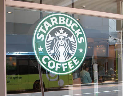
In case you didn't already realise, those bits at the either side of the mermaid are the ends of her tails.
Now, perhaps I'm overly influenced by post-feminist reconsiderations of mythological creatures (thanks to Amazon you can sign in and read up on the subject). But if that's your logo - that two-tailed mermaid* holding her lower extremities in the air and smirking - then your family-friendly image is showing some cracks.
Yeah, I said it.
Honestly - I am not the only person to notice this. In fact this guy Deadprogrammer's blog that looks good has a complete history of the Starbucks logo that ... um ... reveals everything.
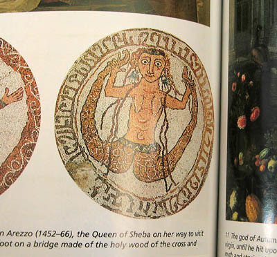
Another site has a 'sea goddess' the full pose (with a figgish sort of leaf over the nautical bit) on an Italian church, and the mythology book I linked to above has something from a 12th century mosaic:
Now the question is: does knowing this make you more likely or less likely to go to Starbucks?
* Apparently that makes her a (non-homeric) siren, though whatever she's doing to lure sailors to their deaths it doesn't seem to involve singing. Not that there's anything wrong with that.
ADDENDUM: There now. You see? Right-winger bloggers don't have a monopoly on softcore porn.
Our local shopping centre - the Westfield Queensgate mall - has been expanding. I reckon it's alright, as far as big places where you can shop go. But probably not worth trekking out from Wellington for as a matter of habit.
Anyway, towards the end of last year - as I recall, around the end of the election campaign -
the attached Woolworth opened and we got to see the mall's new carpark signage. In the context of certain billboards, I found it kind of amusing:
I recently noticed another example of that kind of thing at Upper Hutt's "H20 Xtreme" swimming complex (which, I might add, is actually too much fun). Going back into the changing rooms the signs read:
Women Men
From out of the mouths of architects...
I also want to share another view of the mall, on the outside of the food court. But first I should point out that my penchant for spotting unitended visual innuendo is such that it actually caused some distress to my classmates in design studies. So if I'm alone in my reaction, well I guess I'll apologise right now.
My, but she seems very pleased to be looking down the barrel of that saucy sausage.
To complete my survey of smutty corporate communication, I needed a Starbucks. And conveniently, one's just opened up across the road. What's so smutty about the Starbucks logo? Well take a look. And ask yourself, in particular, what bits of the picture they are hiding.
In case you didn't already realise, those bits at the either side of the mermaid are the ends of her tails.
Now, perhaps I'm overly influenced by post-feminist reconsiderations of mythological creatures (thanks to Amazon you can sign in and read up on the subject). But if that's your logo - that two-tailed mermaid* holding her lower extremities in the air and smirking - then your family-friendly image is showing some cracks.
Yeah, I said it.
Honestly - I am not the only person to notice this. In fact this guy Deadprogrammer's blog that looks good has a complete history of the Starbucks logo that ... um ... reveals everything.
Another site has a 'sea goddess' the full pose (with a figgish sort of leaf over the nautical bit) on an Italian church, and the mythology book I linked to above has something from a 12th century mosaic:
Now the question is: does knowing this make you more likely or less likely to go to Starbucks?
* Apparently that makes her a (non-homeric) siren, though whatever she's doing to lure sailors to their deaths it doesn't seem to involve singing. Not that there's anything wrong with that.
ADDENDUM: There now. You see? Right-winger bloggers don't have a monopoly on softcore porn.